Challenge:
Use Figma to design an app that solves the problem of "inequality". In this process, it is required to understand the user's needs before designing.
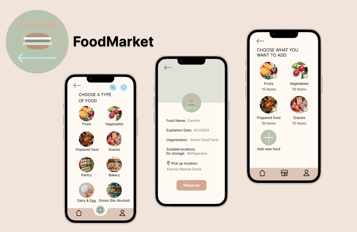
This is the user interface of an app made with Figma that addresses the issue of food equality.
Use Figma to design an app that solves the problem of "inequality". In this process, it is required to understand the user's needs before designing.
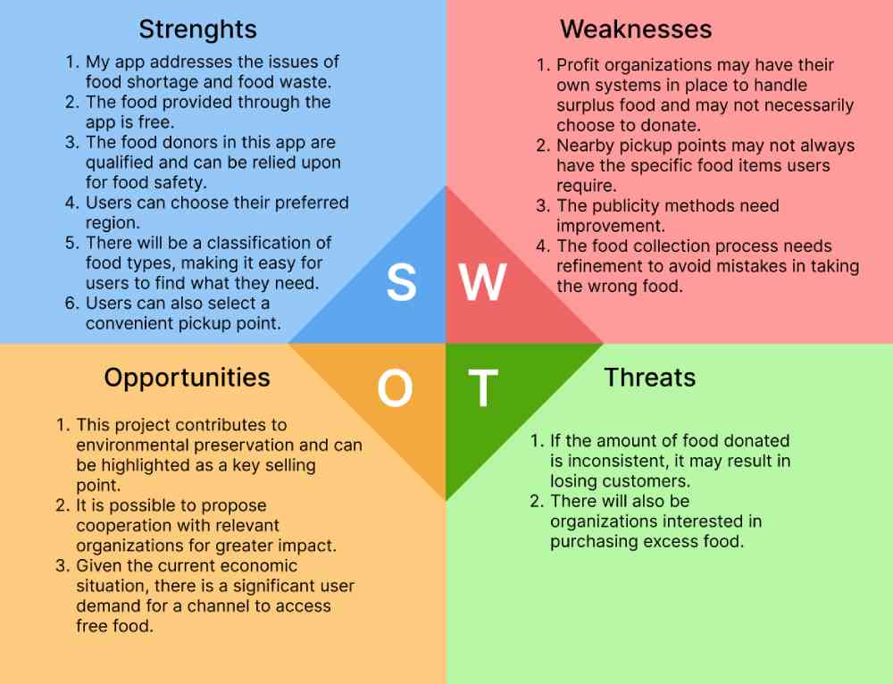
First I did some research to determine the problem of "inequality" that I wanted to solve and the functionality of the app. After I had a rough idea, I interviewed 3 target user groups and did a SWOT analysis. After getting some feedback I modified some of the features of the app and then started working on the user interface design. At the beginning of the design, I decided on different fonts, color schemes, and some button designs, then I made the User Flow and added colors, images, icons, etc. I also made the user interface design.


